

Today is repeat day, but if you have any new suggestions for us to explore reach out to backinthebronzeage@gmail.com.
Redartz: Oops, sorry to so rudely interrupt you, partner! Just wanted to give all our friends one last chance to submit pictures of their fan art/drawings for our next "Show and Tell", coming up within days. If you have any creative fun you'd share with us, please send it to the email Marti so kindly provided above. And now, we return to our illustrious Martinex1...
Take it away younger me...

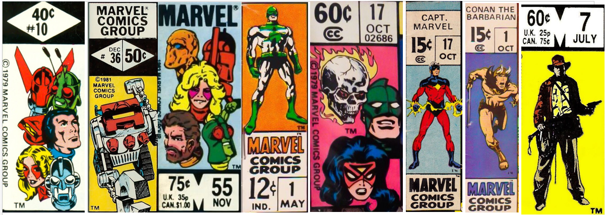
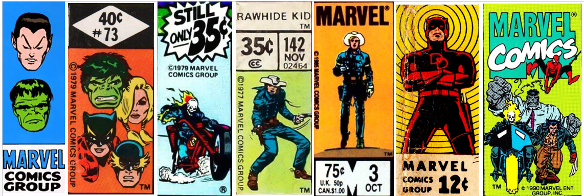
Martinex1: Marvel really had something special going on in the upper left hand corner of their comics. From nearly the beginning, they carved out space on the cover to identify the characters within. The heroes were easy to see on the shelved newsstands as the comics were layered for visual access. The company quickly realized that they were onto something as they even advertised to "Watch for the Greatest Symbols in Comics!" It may have been Stan at his hyperbolic best, but I have to say that there were actually times that the corner box made me buy a comic. Looking back at the history of that iconic marketing tool that lasted decades, I cannot believe how many variations existed. In this post I share more than one-hundred examples, and I dare to say that I have only scratched the surface.
During my comic purchasing peak, I inspected the cover and looked for the sometimes subtle changes in the corner box. My favorites varied from the John Byrne floating head depictions to the rotating spotlighted team members in books like the Micronauts. One of the most clever examples included a run on the Incredible Hulk in which the Hulk in the corner box transformed from a scientist into the rampaging character if the reader handled sequenced issues as a flipbook. (The proof of that down below came from the thejadegiant.com website).
What were your favorites? Which were the best? And which were the worst? Enjoy!


6 comments:
Have a soft spot for John Byrne floating heads, yet another thing he contributed to so many Marvel team books.
Although I also liked his individualized corner boxes during the FF run...usually three heads and rotating a full shot of one rotating member
Those X-Men progressions take me back, too
Omissions from the ones shown: I didn't spot a Vision corner box. Those were cool, and an amazing symbol of his status on that team for 100 issues or so...
Also liked that Frank Miller Daredevil one, with him very shadowy, skyscraper in the background, his billy club cable whipping in the air.
Thanks for the fun topic!
-david p.
David p. Yes I definitely missed the Viz, and his emerging out of the corner is a great image.
I too like what you mentioned about Byrne's Rotating FF corner box. But unlike you I was not a fan of Miller's DD corner. I thought it was distracting and I don't always like when the characters burst from the corner. If it's done subtly I like it but that DD and the Cockrum X-Men where they crowd out of the box I did not like. Just my preference.
I also have to say looking at the corner box for Team-Up and Two-in-One and Premiere was always fun for me because it often had characters that didn't have their own book. Seeing the corners and logos for characters like Deathlok, Black Widow, Thundra, Wonder Man and the Shroud was a blast.
Martinex1
Fair enough, that DD image did stick out a bit. And I am a fan of the classic DD arms-crossed/radar-on look (remember that short-lived one during the Mazuchelli years with him hanging off the building with his radar? I kind of have mixed feelings about that one, it's a bit "busy" for such a little box. Still, reminiscent of a good era...)
I liked the MTU/MTIO "debut" headshots of the guest stars as well. And just wanted to shout out to West Coast Avengers limited series #1, with Hawkeye and four silhouettes. Guessing who they represented was a fun exercise before cracking open the cover (as I recall, I got 'em all right, with a bit of Marvel Universe handbook Avengers entry reference).
-david p.
I should have included that WCA corner box with the silhouettes and question marks. Good call.
I well remember following month to month and keeping my peepers on the Fantastic Four corner box to see which one of the Fab 4 was featured. Seems like Thing and Torch took the lion's share, but every now and again Invisible Girl would get the nod with Mr.Fantastic showing up a bit more I think.
The vintage X-Men one always appealed to me because it has actual composition in it with a foreground Cyclops and the others behind.
Rip Off
Nearly every one of those evokes some type of memory, almost all fond ones! That compilation should be a poster...I'd buy it and put it up!
Post a Comment