

Martinex1: We have discussed buying a comic because of the cover. We have talked about buying a comic because of the characters therein. We have opined about buying a comic because of the creators involved. But have we ever thought about buying a comic because of the cover design - and particularly the logo?
The answer to that is, "Probably not!" The logos and headdress for comic books are relatively benign. They are definitely stylish but they are more necessity and less inspirational. But I find that I notice the font and style of a title, and it says something to me about the era, the genre of the book, and the relative seriousness of the story.
With nostalgic influences for certain, I gravitate toward certain fonts and types. And I associate certain waves of collecting with the changes made.
Today let's look at some of the art, and I will leave it open for your further commentary as I am sure we all will see these slightly differently.
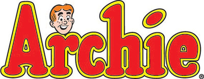
Let's start with Archie Comics and the joy in their titles. There is something inviting, soft, and harmless in lettering. Every letter is rounded, no sharp edges at all. The dot on the "i" is slightly askew giving us an off-centered approach. The outlined letters give us a cushioned and comfortable feel. Nobody would mistake these for horror or suspense comics. And the basic titles for Archie, Betty and Veronica, PEP, etc remained virtually unchanged for decades. There were many imitators along the way, but these logos don't get the credit they deserve. Heck, even we here at BitBA mimicked the style for our "Funny Books" columns.
The Archie logos never seem old-fashioned to me. Perhaps they are just right. I cannot really imagine how they can be modified for the better. Some logos don't age well. I find that true for many comics that have weathered their way through the Gold and Silver Ages. Take a look at these.
I appreciate these examples. But I can also see that they have aged. The cursive Wonder Woman does not seem bold or strong enough. It seem unimaginative and appropriate for an old laundry detergent advertisement but not for the strongest heroine on the planet. The Action Comics
pulls on my childhood memories, but there is something very 1930s about its appearance. It seems suitable in style for an old radio program. Does the combination of straight lines and curves have an art deco feel that resonates with an older era? The X-Men had a very aged look with the jagged edges on the "X" until it was redesigned for lasting effect during the Neal Adams era.
Before we dive too deep into DC and Marvel mainstays, let's take a look at the Atlas-Seaboard comics from the Bronze Age. The upstart company mimicked some of Marvel's cover styling, but I think they created some fascinating and unique logos during the short life of the company.


I enjoy some of these very much. For my eye, The Brute, The Destructor, Grim Ghost, and Sgt. Stryker's Death Squad are attention getters. The weakest for me is Ironjaw; aside from a strange concept, the look is odd. Why the two fonts within the word? Overall though, I think Atlas-Seaboard showcased new talent and the logos seemed in line with that with each logo reflective of the content within... scary, forceful, mysterious.
There are some logos that I consider perfect and untouchable. Two that would fit that category for me would be these versions of Amazing Spider-Man and The Avengers. There have been many iterations over the years, but these stick with me.


Some books have stuck to the initial design through decades of publishing, while other titles have tried to change and modernize their look, with varying degrees of success. What do you think about these logo designs?


Some of those rank very high on my preference list. The Captain America and Falcon example is a favorite of mine. I like when they included the red, white, and blue stripes in the lettering. I like the original Fantastic Four look, but I did enjoy the other version in the late 1970s when it first appeared with different character art. Iron Man seems perfect. But I don't care much for Ultimate Spider-Man at all; it is very busy and looks like the chrome grill of an old Chevy. And while creating this blog is always a learning curve, I had no idea Quicksilver had his own book or logo.


Does it help to see how a logo works within a cover image? I always thought Ghost Rider and Iron Fist had nice designs. But perhaps the flames around the Ghost Rider lettering could be more apparent, and the rivets in the Iron FIst logo seem out of place (his fist is not really iron whereas Iron Man's suit is indeed metal).
So what are your favorite logos? What books - whether mystery, suspense, funny animals, humor, westerns, or super-heroes - had the best logo designs. Are there logos you love and are nostalgic? Are there logos you despise and wish were changed? Do you notice the logos when you make your purchases or are the words and letters invisible to you? Vote for your top three logo designs; and what were the worst? Today, let's discuss this important facet of comic book cover design!
And if this topic generates enough discussion, perhaps in the future we can discuss the many other aspects of the comic masthead like the company logo.
