

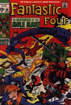
Martinex1: I have expressed before that I enjoy covers that use monochromatic (or nearly monochromatic) style. The less mash of colors, the more attracted I am to a book. It is not for everybody I know, but I find it appealing. Today let's take a look at "red" books that use the bold color as a wash and as a background. We will also gander at comics that have varying red hues - from sunburst orange to slightly pink. As you consider your choices for today, choosing only four out of the broad offering, consider how the color was used and if it truly met the need of the cover's story. Let's start with some of the more consistently uniform use of red. After hours of comparing and contrasting, I found that the Marvel heroes rose to the top. The Fantastic Four particularly used the color frequently and in aggressive amounts. Perhaps in their case the coloring of their uniforms lent itself to a nice contrast. But in general, Marvel liked to use the technique. Although there have been earlier examples, the introduction of the modern Vision in Avengers #57 set the standard.


When used more as a background or an accent color, red still pops when on the rack. Harvey Comics used it as a nice contrast to their uniformly colored characters like the white Casper and the yellow Baby Huey. Their characters like Wendy and Hot Stuff, however, used it sparingly for obvious reasons. Likewise we start to see other comic companies using red in backgrounds. The Fantastic Four continues to use the color liberally. Characters like Daredevil have many examples but typically by limiting the background and focusing on the costume.


As a primary color, surely red has an advantage. It has continuously been used as a basic element of costume coloring from Spider-Man to Daredevil to Deadman, Red Tornado, Adam Strange and countless others. But does it work as a main cover element?
Does the color of rage and anger float your boat when it comes to comic covers? Do you have other more majestic examples to share for comparison? Which of today's offerings are the most compelling? Which used the palette to the best advantage? Would these leap off of the spinner rack when positioned amongst other hues? Which are your favorite four - based on aesthetics and not monetary value? Why do you appreciate the graphic elements of those particular examples?
Enjoy the day and keep the BitBA conversation going today by sharing your color commentary. Cheers!
8 comments:
Baby Huey, Hot Stuff, Casper, and.,,,Red! Incongruous perhaps, LOL???
Though I do enjoy the emotional feeling of a monochromatic cover and its way of enticing the potential purchaser to grab it off the rack, I can't help but wish for a full-color version of FF 220 and Avengers 57 to enjoy as a poster. Those are such classic images that I want to savor them in all their potential glory. Otherwise, I agree with you.
Wow, that's a lot of FF. I actually have X-Men 284; the story is ... not great.
Some characters lend themselves to the use of red: Spidey, Superman, DD. Amazing Spider-Man #50 comes to mind as a cover with plenty of red/orange on it.
In general, I tend to like "realistic" covers, so the monochrome look is sometimes a bit much for me, but it can work. I guess it depends on the subject (or what kind of mood I'm in ;))
Oh, and if this is a regular Quarter Bin challenge, I guess I'd take Teen Titans, a couple of DDs, and maybe an early X-Men.
My winner is X-Men #17. Sadly Jack Kirby only drew the cover and the Splash Page. The rest of the inside pencils are from Werner Roth, and they are not good. But the cover is beautiful, could be a horror movie poster.
Fantastic Four 220 is a sentimental favorite of mine. An early issue in my collection. Love their expressions and poses.
I love red covers. And no, it has nothing to do with my pseudonym...:)
Marti, you're right about those Harvey Comics covers. Those really pop. Solid design and color theory! Yes!
Those FF covers are beautiful. But then again, so are many of the others. One sentimental favorite red cover: Marvel Treasury Edition 1, with the classic Romita Spider-Man cover. It just MADE you purchase the book.
And overall, those monochromatic covers are winners. A problem I find with some modern covers is the excessive busyness, and color overload. Using every hue in the toolbox only muddies your artwork. By limiting your palette, you can emphasize specific areas and draw the eye where you want it. Design 101...
Thanks for such a great topic Martinex!
Wow I have several of these, but from among the ones I don't I'd have to take:
1) Avengers 57. Can't walk away from this ish under any situation whatsoever it may arise.
2) Iron Man 13. Controller's whole costume is blue. And kinda plain. Saturating it, everything in the background, and nearly drowning Shell-head in red is really kinda brilliant as an out-of-left field move.
3) While the deck may be stacked for the FF, I'd have to pick #81. Something about bringing out Crystal specifically in yellow and then creating a band across the middle as she stands between two sets of Kirby bubbles is very intriguing and gives the cover depth.
4) Strange Adventures - The Man with the Head of Saturn. More for the overall concept and art than for the red alone. How cool is that!
Honorable mentions to :
Rom 43 - I seem to recall that he is in a radioactive wasteland in the USSR, so it's a nice use of the red thematically as well.
Strange Adventures - Doom from Planet X. I'm not sure why, but I find the choice of red here surprising. Maybe because it's usually something darker?
And I just can't pass without recalling my disappointment at that cover of Micronauts 27. I thought at the time that it must look so much cooler with a deeper red and was sorry that my copy must have had the color washed out somehow. Now I see it was probably the actual chosen shade, and I'm disappointed all over again.
But only at that issue! All the rest was terrific, thanks again, Martinex!
Iron Man #13 my winner. Tuska's art really works with the all red.
Little Dot pops out at me also.
Of course Avengers #57, very powerful, would've been less so if in full color IMHO.
X-Men #17 really shows the desperation of their situation.
Would've grabbed most of these off the rack.
Not shown; Spider-Man #50. Iconic cover "Spider-Man No More"
Thor #153. Great yellow contrast to the mostly red cover.
Post a Comment