Showing posts with label Harvey Comics. Show all posts

Tuesday, November 27, 2018

Follow the Leader: Episode 101: Not from the Big Two...


Redartz:  Greetings, all; and welcome to another weekly dose of bountiful Bronze age badinage! You all know the routine; the first commenter names the topic of the day. But before we get to the action, here's a little personal tidbit. Recently my wife and I have been nosing around flea markets and  antique malls , all part of holiday shopping (that's my story and I'm sticking to it). One one such visit recently, in a small town antique shop, I happened to come across a small wicker basket. In said basket lay a stack of bronze age comics! Notable in that they were in pretty nice condition, I leafed through them; most were nothing of interest. But I did pick out two comics from the long-defunct Atlas/Seaboard line, an issue of Iron Jaw and the first issue of Howard Chaykin's Scorpion. I've never read any of those Atlas books, so a dollar each seemed a safe price for the experiment. I'll let you know how it comes out...

And now, the mike is yours! What shall we discuss today...

Saturday, June 30, 2018

This & That: Our ...Somewhat Less Than Favorite Covers...


Redartz:  Hi folks! Not long ago we did a post about our favorite comic covers. In the interests of balance and full coverage, it seems natural to consider the other side of the coin: covers that, shall we say, didn't light our fires. And this is not to disrespect any particular title or artist; it's just that these covers failed the 'cover would make me buy it' test by a long shot.

First off:  This cover for Avengers Annual 10. For the most part, I like Al Milgrom's work, but this cover is just way too cluttered. All those panels, unevenly spaced. An overabundance of text certainly doesn't help. And this doesn't even address the "Columbia" banner across the top. As great as the interior was, the cover wasn't.


 Next up are two covers from Ross Andru, featuring the banner characters of each of the Big Two. As with Milgrom, I usually like Andru's work. At least, his interiors. Somehow, though, I always felt he lacked something when it came to his covers. On Superman, it just looks blocky- there were numerous such covers about that time. Kind of an uncomfortable viewing angle; good thing Supes wasn't turned a bit or we'd have gotten a Super booty shot. As for Spiderman 157, again we have some rather clunky figures; along with a flat background. Coming during the heyday of John Romita covers, seeing this from Ross was dismaying...


Turning to a couple of my favorite artists, here are examples that just go to show that nobody's perfect. Avengers 162 by George Perez? Not a bad cover, certainly. But as good as he usually is, this seems a bit unremarkable. And the action is difficult to follow; the composition seems rather scattershot. And Ultron looks a bit cartoonish, strangely.


 My other bronze age favorite: John Byrne, of course! But not because of this cover, I'm afraid. Byrne could do wonders depicting Ben Grimm, so what happened here? Fantastic Four 274 is the book, and our rocky friend Ben is the subject. But he almost gets lost amongst the rubble and bricks. Even the Thing's look seems off. Strange, as Byrne provided some fabulous cover art during this same era. Again, nobody's perfect.


Speaking of perfection, many folks would consider Jack Kirby the perfect comics artist. He's always the King in my book, but even he has some clunkers. This cover for Fantastic Four 78 always struck me as off; especially Ben Grimm's human face. That's quite a nose he's got there.  As for his later work, some of it was incredibly cool. However this cover for 2001 issue 2 looks like an ad for Max Factor mascara. Kirby could get pretty loose with some of his later drawing, but this cover was a bit too loose for my tastes. 


And how about this cover for Daredevil 69 by Sal Buscema? For one thing, that's a lot of prominent word balloons. Especially distracting against that black background. As for the art itself, Daredevil looks like he bulked up quite a bit. He almost resembles one of Carmine Infantino's famous DC apes. And it's a minor thing, but it bothers me: DD's mask has that sharp black shading, but the rest of the figure just looks flat...


And here are some more general cover comments. Photo covers can be quite effective: the classic cover to Submariner 7 for example: Namor looks amazing as John Buscema depicts him rising above the streets. On the other hand, this Spider-Man cover (from ASM 262) just looks a bit cheesy to me. Perhaps it's the combination of hand-rendered art and photography that works for me; the photo alone just lacks punch.
 

 Finally, this cover for Justice League of America 23 (2006 series) exemplifies one of my pet artistic peeves. Specifically, it has no sense of design. It's an over-rendered mess. Fine linework is great, but not when it gets totally lost in Too Much Detail. Everything in this cover mushes together visually, with the exception of the logo and Wonder Woman. And really, I don't mean to be critical, but it is a problem way too common with comic cover art in the modern era. This cover could have been more effective if, say, they took out half the characters and blacked out the background. Then you could actually make out individual figures and actions. It reminds me of my first year drawing class in college: what you leave out is as important as what you put in. 


Okay, I've pontificated enough. I'll turn the mike over to Marti; let's see what he's got for us...
 

Martinex1: Thanks for getting us started Red!  There are a number of comics that rub me the wrong way.  And it is not necessarily because the art is bad, some of my selections will actually be from some of my favorite artists who are definitely superstars.

Martinex1: My first choice in this rather dubious post is for Avengers #228.  Al Milgrom pencilled this piece.  I think the cover would have been one-thousand times better if he actually had Hank Pym in costume.  It is the "Trial of Yellowjacket " after all, and the cover can be symbolic if he doesn't wear his fighting togs in the story itself.  That choice really diminished the cover.  On top of it, I have never liked that Hank is very indistinguishable from Steve Rogers, Clint Barton, and Donald Blake when out of costume (which is probably why those characters are fully suited up in the background).  I believe this should have been corrected by editorial.  This cover just was not good enough.


Martinex1: I really admire John Byrne's art.  He is definitely one of my favorite artists of all time.   I know some people don't like his style, but I have always found him to be an enjoyable and clear storyteller.  I also think that many of his covers are iconic - just take a look at Uncanny X-Men #141 or almost his entire run of Fantastic Four covers.  It is a bucket list type dream to own original cover art from Byrne.  But I would not want to own one of these.  This particular FF cover does nothing for me.  I have commented before that I am really turned off by "civilian" covers when I am looking for super-heroes. It is of course rendered quite well, but thematically it does nothing for me.   This Alpha Flight cover is a miss for me also.  I think the extreme close-up works against the layout - it wants to be "in your face" but it comes across as strange and unshapely.  If he had pulled back just a bit, it may have been more effective.  Having said that though, it may not be the pencil art at all but rather the color that is off-putting.  The pink header does not work well at all against Sasquatch's orange fur and it actually seems to cut off the top of his head.  I am not sure if the whole thing would have looked better if the entire panel was orange.


Martinex1: George Perez is another favorite of mine.  But I have never liked covers that put the characters in a distant shot.  Covers should be bold in my mind; the characters should be larger than life. Something about the size of the characters diminishes the cover for me.  It would have been a perfectly fine internal panel, but for the "marketing" of a story, I thought this was a miss.  This cover is actually famous in a sense as it is well-known that the graffiti on the train car includes the names of many comic creators and co-workers from Marvel.  It is a novelty in a way, but I felt that the touching tribute to his peers actually minimized the action because he needed to pull back to use the space on the train car.   I am torn on this one, but it does not work for me and back in the day I delayed buying this issue from the spinner rack for a long time.


Martinex1: Bob Layton is just fantastic and he had an iconic run on Iron Man along with writer David Michelinie.  I like his work even more now as I have recently been looking back at his key run on the book. Layton also shares some of his work on Twitter, and I always check it our because it is fantastic.  This cover however always seemed rushed because of the strangely proportioned characters.  I know it is supposed to be a forced perspective to indicate the characters "coming at you," but it is just too much.   Wolverine's lower leg is much too large and Spider-Man looks fat.  It always strikes me as weird, like a fun house mirror version of the characters.  I don't like it.


Martinex1: Metal embossed covers never did anything for me.  I found it very hard to see the art.   The Avengers had an intermittent series of this type of cover during the Gatherers story arc.  I preferred the second print  or newsstand versions so that I could actually see the art.  Steve Epting and Tom Palmer were a great team, but I could not even distinguish the characters in the embossed version; the art was just lost.


Martinex1: Archie Comics and Harvey Comics are spectacular and we don't discuss them enough here. And I know you are going to say, "What?  How can you criticize this classic art?"  And I would respond that it is not at all the art that bothers me about these covers.  My beef with these publishers though is that I can never recall what is inside a particular issue because the cover does not tie to the stories.  There are old Archie tales that I remember so fondly.  A beloved cousin gave me a ton of Archie issues when I was little, and after losing them decades ago to childhood wear and tear I wanted to recreate the collection.  It is impossible  For the life of me, I cannot recall a single issue cover to try to source the comics.  I have absolutely no point of reference.  That was never true for super-hero tales back in the Bronze Age.


Martinex1: On the other hand, more modern comics have embraced the poses and poster shots for covers and I hate it.  Take a look at the comics below.  They may indicate what heroes are in the issue (maybe) but there is absolutely nothing about these covers that indicates anything about the story inside.  I really dislike that immensely.  In the future, any collectors will have the same concern with Marvel that I have with Archies and Harveys.  The embracing of these stock shots is misguided I think.

Redartz:  Marti, I so agree with your thoughts about those 'poster shot' covers. Once in awhile is fine, but almost every issue? No, give us some reference to the interior contents to entice us to buy. But hey, it's time for you all to chime in. What do you think about these covers we've chosen, and what covers can you think of that left you cold?

Saturday, March 10, 2018

Chew the Fat: Company-Jumping Characters!


Redartz:  Every comic company has its iconic, trademark characters. What would Marvel be without the ever-amazing Spider-man? Or DC without Batman?  Archie Comics have, well, Archie. Disney and the ducks go hand-in-wing. You get the idea; many characters are intimately identified with their parent company, and many of those companies go to great lengths to keep those characters close.

However, over the years, numerous characters have started their print careers under one company, only to make a switch to a competing company later on. Whether due to a copyright battle, a corporate buyout, or changes in licensing, many notable characters have seen publication under more than one banner. This makes it challenging for the collector, and probably a headache for Bob Overstreet; but that's the comic biz. Let's look at some of these 'company jumpers'...


Captain Marvel


"The Big Red Cheese" moved from Fawcett to DC years after legal wrangling in which DC claimed the character violated their copyright on Superman. One wonders how Marvel would have liked to get their hands on the Captain; they put the name to use at any rate.


Tarzan


Edgar Rice Burroughs' "Tarzan" appeared for years under the Dell label, and then under Western's Gold Key. DC got the rights, and continued Gold Key's numbering. Marvel took over in the later 70's with a new first issue, and art by ace John Buscema.


Conan the Barbarian


 Marvel won rights to Robert E. Howard's barbarian, and presented his adventures in various formats from the 70's through the 90's. The new Millenium saw Dark Horse Comics publishing Conan, until recently Marvel regained the rights. Although a licensed character, I'll always associate Conan with Marvel...

 
Yogi Bear


 Hanna Barbera's famous picnic basket thief seems to have made the rounds of comic companies as thoroughly as he did the picnic tables. Gold Key, Charlton, Marvel, Harvey and even Archie Comics! How did DC miss out (although I could be unaware of just that eventuality: DC has access to Hanna Barbera's retinue, and have been making great use of them the last few years).


Jonny Quest


One lonely issue from Gold Key was all you could find of the iconic boy adventurer for many years, until in 1986 Comico began it's fine run. In the 90's Dark Horse picked up the franchise with the "New Adventures".
 
Darth Vader


 Marvel struck gold by getting the rights to "Star Wars" putting out the first issue before the film opened. The House of Ideas kept it up for years, through the mid 80's. But Dark Horse picked up the ball  (or Death Star, if you prefer) and ran with it beginning in the 90's. Yet once again, Marvel recently re-acquired the rights and is putting out numerous series once again.


Blue Beetle


 Blue Beetle debuted at Charlton in the 60's, by the great Steve Ditko. In the 70's Modern Comics reprinted some of  his Charlton appearances. Not long afterwards, DC bought out Charlton's stable of heroes (as they had with the Quality characters), and made the Beetle a part of the great Justice League International series.


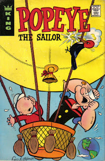
Popeye


 The immortal Sailor Man, like Tarzan, has been published for many decades under many banners. Gold Key and Charlton featured him through the 60's and 70's. In the late 80's, Harvey put out some issues (what was up with Harvey back then, anyway- not just Casper and Richie Rich anymore). Most recently IDW has been putting out some fine stories...

There you have a few examples of 'wanderers' among the various comics publishers. No doubt you can come up with more. And of these pictured here, who do you feel did the 'best job' with a given character? Which characters do you identify with which publishers? Go ahead and 'chew the fat'...


You Might Also Like --

Here are some related posts: