Martinex1:My partner and illustrious co-host Redartz came up with the brilliant idea to have an ongoing section of the blog to explore various aspects of comic art. Here we may be looking at original art, pencils, inks, selected panels, storytelling, design, structure, artists, splash pages, and techniques. Anything to do with the comic craft and creation is fair game in this section.
Those of you that know me, know that the Count Nefaria arc in Avengers #164 through #166 initiated and firmed my life-long comic collecting. The story has remained amongst the top of my favorites for decades. So I would like to discuss some aspects of its story design here, while paying particular attention to a single page.
Recently I reread the tale and was fascinated by the succinct yet complex storytelling. The creative team juggled a dozen characters each with diverse but merging motivations and story beats. I believe John Byrne, particularly during this era, interpreted the scripts keenly while also enhancing the work with expressive characterizations. Whether with Chris Claremont, or here with Jim Shooter, he brought out the best in his collaborators. But Shooter is no slouch as he ably maneuvered through the melodrama and tension within the team while also creating an adventure that continued to grow in conflict before coming to a satisfying resolution. In those issues, Shooter covered the Beast's insecurity amongst the scientists like Pym and Stark, Captain America's frustration with the lack of team discipline, Wanda's worry over the comatose Vision, the Whizzer's health issues, Thor's intermittent and mysterious disappearances, and Simon William's mysterious powers and insecurities, just to name a few. He also covered the motivations for the villains Power Man, Whirlwind and the Living Laser, while also introducing Henry Peter Gyrich along the way.
How did they do it? How did they cram so much detail in a three issue arc? Below is a page from the second issue of that run after the team ran afoul of the newly empowered Nefaria.
Avengers Volume 1; #165
Writer: Jim Shooter
Penciler: John Byrne
Inker: Pablo Marcos
Letterer: Denise Wohl
Colorist: Phil Rachelson

This page (particularly that last panel) has been etched in my memory for nearly forty years. Focused on the two characters of Wonder Man and Count Nefaria, these six panels carry more explanation and characterization than many full length comics. If the readers knew absolutely nothing about the Avengers, the team members, or this particular conflict they would quickly understand Wonder Man's psyche. He is powerful, constantly reminding those around him that he can go toe-to-toe with Thor, yet he is uncertain and afraid. He is heroic in that he goes to battle despite his fear of death. And in the end it is not enough against somebody like Nefaria. The third panel is so expressive as Wondy realizes his best may mean nothing. This recognition follows again in Panel 5 in the split second that Simon understands that Nefaria has not even budged. There is a lot of talking going on as the fists fly, but the word balloons do not interfere with the action at all. In fact, I feel that the length at which it takes to read the dialogue allows me to peruse the panels at a more reasonable pace until it is taken to its shocking conclusion with a simple KA-BLAM!
Now imagine that each page in these issues is just as packed with nuance and that is why the story is so fondly recalled. In addition to the A-list artistic headliners, Pablo Marcos who can sometimes be a little heavy does a wonderful job here as well. I like how he adds a bit of detail to Byrne's normally muddle-free work. I assume some of the facial lines, creases, and hair lines are Marcos' inks. I know nothing about the letterer or colorist, but they stay nicely out of the way (which is important).
An observed weakness however exists in those fourth and fifth panels. They are much too repetitive in my opinion, and I believe a more seasoned Byrne would have found a way to capture that moment of stunned ineffectiveness without being so repetitive.
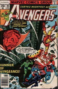
While John Byrne handled the interior art for this arc, George Perez supplied the covers, inked consecutively by John Tartaglione, Mike Esposito, and Ernie Chan.
So now it is your turn, what do you think about this topic, storyline, and page? How about the creators? Does Page 6 meet your standards or is there something amiss? And what panels stick in your head like the last panel on this page does in mine? So without further ado, please join in and speak your mind. Cheers all!