

One style that became extremely popular was the "breakthrough" cover in which the central characters seemed to rip right through the page. This was made most famous by Giant-Size X-Men #1 which was mimicked frequently thereafter. But here are some varieties of those covers from many eras to whet your whistle. Whether breaking through webbing, newspaper, quantum barriers, or the comics themselves, this was a common method if introducing the stars of the story.


Another method of introducing characters (and a style I like) was to have the character positioned in front of monochromatic or simple backgrounds with some inked action scenes, events, faces, or comic panels behind them. Both DC and Marvel employed this technique from time to time.


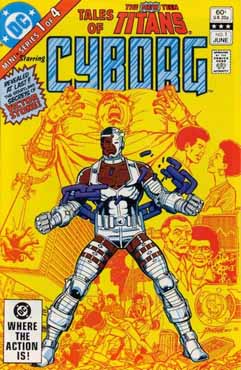


A variation on this is the character standing in front of an explosive or flaming orange and yellow background. This too may happen more frequently than you realize.


Back in 1986, during the November celebration of Marvel's 25th year, each comic got a makeover. and featured a portrait of a character therein. While I liked the style, I still did wonder what was going on inside as I always preferred the story preview on the cover. Here are 28 books that followed this editorial directive for the anniversary. It is hard to believe that the Marvel's 25th year occurred 31 years ago. Yikes, I am getting old. I consider that period to be around the end of the Bronze Age and at a time that my collecting really tapered off.


So what do you think of these examples? Which overarching style do you prefer? And since it is the Quarter Bin, this is also an imaginary sale - four comics for a dollar! Which would you choose? Which was your favorite in each category? And test your knowledge and memory - can you tell us what the story was inside any of these mags? If so, which do you recommend for our reading enjoyment?
Have a great weekend and as always... Cheers!
7 comments:
Very happy memories from those 25th anniversary covers.
In general, this is a fun style.
Captain America seems especially suited to these, I'm surprised you omitted Kirby's iconic image (I think it's #193?), the Cap pose that' launched a generation of Cap posters, stickers, etc.
-david p.
Charlie suffers from the heuristic known as notalgia-itis. Gimme the ASM, CAP, Liberty Legion and then Thor with the Big G in the background!
That new stuff from the mid-80s: I actually have never seen a single of these covers. So "no comment!"
I never read the THor - Galactus encounter issues 169. Anyone know if it is quality stuff worth reading?
ENjoy the day!
I have some of those 1986 anniversary issues; I think Cap 323 was the first appearance of Super-Patriot (later to become Captain America and U.S. Agent); X-Men was Wolvie vs. Sabretooth, I think; Amazing was the X-Factor x-over; Marvel Tales was a reprint of MTU 59; and I can't remember the other Spideys, I'd have to look them up.
I think that Superman issue is the one where all the kryptonite on Earth is transmuted to lead.
As for which four I'd pick ... probably three of the Spideys plus New Warriors #1, since I always liked how Nicieza wrote them.
How could I not pick Giant Size X-Men #1 if I am getting it for a quarter? I'd sell that sucker in a minute! ;)
I love those 25th anniversary covers, and a friend tried to convince me to make collecting them all a project (but I settled on collecting all the Asst. Editor's Month issues instead).
As for the other three?
Teen Titans #23, Thor #169, and Tales of the Teen Titans #1.
I'll go with the 2 Thor covers, Teen Titans 23 with Wonder Girl, and Starfire on Tales of the Teen Titans #4.
That Tales of the TT series, it seems to me wasn't as good as the regular series, but had some nice covers. Firestorm #1 brings back good memories. I liked that series at the time. Conan looks quite pouty on the cover of 188 for Marvel's 25th anniversary-- party pooper?
Wonderful topic Martinex!
I owned a few of those comics. The GS X-Men was one of my first so that cover is burned into my brain, I read that thing dozens of times.
I also have fond memories of that Superman cover as I used that image for a colored pencil project in high school.
My favorite category is probably the "monochromatic" style with those iconic Sub-Mariner and Iron Man poses.Classic!
I wasn't around for the 1986 covers so no nostalgia there.
My 4 comics will be those I did not own;
Sub-Mariner #1
Iron Man #1
Spider-Man #19
Thor #154
And here's a couple that weren't shown Batman #200
and my namesake from War of the Worlds #18, yes wearing that outfit :-)
My favorite among these is the 3-D Man cover, it speaks to the nature of the character beautifully. Captain America #109 is a longtime fave too, one of Kirby's best images of the character he co-created.
Rip Off
Post a Comment