

Martinex1: Forgive me for indulging again in the topic of Marvel reprints and their covers; I apologize if I have used some of these examples before but I am fascinated by the cover art and the various types of changes that were made.
Many of us learned the origins and Silver Age histories of our favorite characters through the reprint titles that ran from the late 60s though the 80s. In fact, reprints like these can be said to frame the timeline of the Bronze Age. Often while reading the current adventures of the Avengers, Spider-Man or the Fantastic Four, I was able to delve into their colorful history in books like Marvel Tales, Marvel Triple Action, and Marvel's Greatest Comics. While enjoying Claremont, Byrne, Shooter, and Miller on one end, I could dive back and bask in the wonders of Lee, Kirby, Ditko, Heck and others.
As I seriously started collecting back issues to complete runs of my favorite series (particularly Sub-Mariner and the Avengers), I began to recognize the differences in the covers - some slight and subtle and others glaring.
Let's start with Sub-Mariner, as reprinted in Tales to Astonish in 1979. In this book, it was typical for the cover art to be flipped in a mirror image of the original. You can see that below from the heart of the Serpent Crown story line. I definitely prefer the Marie Severin original. The original composition and deep red background catch my eye much better. It is said that the reader's gaze is drawn to the right side of a page as it is where they look to turn it, and the anguish on Namor's face is readily apparent. While more details, like the shackles, the snakes in the carving, and even Namor's musculature, may be more apparent in the new version, I still prefer the original.


Here is one of the most iconic photo edited covers of the Silver Age era. In the reprint, the entire city background is changed and Namor is re-positioned at a different angle to accommodate the logo.


Marvel Triple Action and Marvel Super Action both reprinted Avengers' stories. One of my favorite stories is the introduction of Yellowjacket, but I really do not like the revised cover. While the original also had a deep red background (the printing and coloring and ink and paper capabilities must have been better), it additionally had tight black rings that focused the work in a mesmerizing fashion. The big white circle in the reprint looks odd to me, and the characters seem to float. But I have to say that I really like the dark look of the UK version.


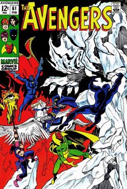
There seemed to be purple and pink hues that emerged during the reprint era, and you can see that exemplified in many covers below. Here the fire giant practically disappears into the background in this mirror image reprint of Avengers #61. It is just not as crisp and clear.

However, I do like the re-coloring of Avengers #64 here. The cosmic image seems more complete and focused. I also like that the circular ship is apparent in the background. It really gets lost in the original.


When Marvel Super-Action reprinted the classic King Size Special, they went with a white background. I don't like it at all - perhaps because of nostalgia and perhaps because the characters against that bold black just popped. One benefit of the reprint of giant sized comics was that they had to spread it across two issues. so at least we get a brand new cover for the second part.


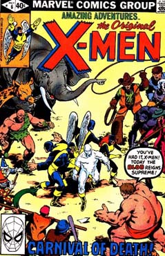
When the X-Men stories were reprinted in Amazing Adventures (also 1979) they used both original and new covers. You can see that the coloring was changed on issue #1, but there are some additional variances. Some of Iceman's snowballs disappear in the reprint and Jean Grey is given a psychic blast.


The reprint for issure #4 stayed basically the same, but it did correct a decades old error. Originally the Scarlet Witch's outfit was colored green for some reason. The reprint took care of that.


Amazing Adventures cut the classic stories into parts - taking one issue and stretching it to two and using the characters' origin stories as filler. That allowed for a half-dozen new covers for the reprint mag. With art from Bob Budiansky, John Byrne, and Al Milgrom we got some nice covers. You can see them all below.


Sometimes even mainstream titles were reprinting stories to fill gaps due to deadlines. The furry Beast originally appeared in the original Amazing Adventures in 1972 and was reprinted just a few years later in this Avengers from 1975. They changed the Beast's fur from gray to blue and they added some floating heads to make it seem like an Avengers' book. I do like the inking on the revised Iron Man better.


Marvel Tales, in its earliest rendition, printed multiple stories under a single cover. Multiple issues were represented with four cover recreations positioned on the reprint cover. I miss these books and really liked perusing these issues in the past. I particularly liked the "false" covers that were created for the Wasp who did not have her own book.


Later in the Bronze Age, the book converted to Spider-Man stories only. Here we have a John Romita cover with the Kingpin. The revision uses the same image but shifts it on a slight angle to accommodate the large heading.


Marvel Tales ran for so long that some Spider-Man stories cycled through twice. Check out the variations. I actually prefer the second because I like the revised blurb "SPIDEY vs JJJ."


Marvel's Collectors' Item Classics followed the format of Marvel Tales with the Fantastic Four as headliners.


When it converted to single issues, the covers stayed pretty close to the original example. In this example reprinting FF #87 uses a red font that I think is distracting. This is one of my favorite Dr. Doom covers - yes, that is him in the shadow.


Until recently, I did not know Daredevil had a reprint book in Marvel Adventure (1975/1976). I prefer every reprint cover over the original. Gene Colan's art is complex, shadowy, and strange. I think the coloring work on the reprints clarified everything and the characters and figures were more discernible. Again, others may disagree.


So what do you think of this reprint madness? Which are your favorites? Do you have other examples to share? Thanks for participating in this challenge to the eyes. Cheers all!
7 comments:
Good morning all. I forgot to mention a couple of details in the books depicted here. 1) The Wasp’s costume is colored to match Goliath’s in the UK version of Avengers 59. And 2) Check out the moving pinstripes on the Kingpin’s suit in the swinging Spidey cover. Why would they move the stripes from vest to pants? That had to be a lot of work.
Love these covers, especially the "bonus" Amazing Adventures X-Men reprints. I got #3 (the Danger Room cover) and could not wrap my head around how I was reading the original X-Men #2, but the cover said #3. Then later I got AA #14 which reprinted #8? It took me years to realize they were splitting the stories.
Still, l loved reprint Marvels: my favourites were Marvel Super Action (Avengers), Marvel Tales (Spidey), Amazing Adventures (X-Men) and Fantasy Masterpieces (Silver Surfer and, better still, Warlock). But I also got FF reprints, Hulk reprints, it was all fun...
Weirdest alteration: I first read the death of Green Goblin as Marvel Tales #99. Years later, on a blog like this, I learned that they cut off the last page from the original story (the famous Mary Jane staying-to-console-Peter scene). Probably would have been dismissed by my 8-year-old brain anyway at the time, I guess...
-david p.
Loved the Marvel reprint titles. In fact, once both Kirby and Ditko had left Marvel I gravitated more to the reprint books than to the regular titles. The earlier material just resonated more with me in both story and art.
As for the covers - I prefer the originals with the exception of the Gene Colan Daredevil covers where the reprints have more snap than the originals.
I love reprints; they're a great way to read older stories without breaking the bank. I have that second Marvel Tales (#163) with the Spider-Slayer robot. Marvel Tales reprinted the first 50 issues of Amazing Spider-Man in the early 80s ... great stuff.
I feel we should also mention that epic occasion when Marvel UK reprinted that Avengers #61 cover with the Vision redrawn as Thor. They did like to take liberties with the source material.
Then again, they topped that when they reprinted the cover of Iron Man #45, with Iron Man redrawn as Spider-Man.
I have quite a few thoughts after this magnificent posting!
1) Marvel (and DC) reprints were every bit as important to me as the monthly originals!
2) I was not aware of DD reprints!
3) I must agree that the reprints are better colored, at least in the sense of being able to see things in the background like spaceships and quantum universes. Nothing but black works for Avengers KS #2, though, a big-time fav cover of mine!
4) I wonder why the economics aren’t there to keep reprinting today? There was a blitz of Kirby reprints by Marvel, these past few months, for $1 each. Was Marvel able to profit at $1 each?
5) Why weren’t other characters, presumably more popular than DD or X-Men, reprinted as well e.g., Cap, Thor, Iron Man…?
6) In times past, going to a comic book in Chicago show definitely (!) included scanning the “cheap” boxes b/c they often included those Marvel Tale, Marvel Super Heroes, etc. $.25 reprints for perhaps $1.00. What a great way to get a blast from the past at a nice price! Loved it! Nowadays, it’s more like $5, lol.
7) Did DC have single-character reprints like Marvel did for Spidey or FF? I don’t recall any. O/wise I much preferred DC’s multi-character 100-page reprints of their golden age to Marvel’s multi-character reprints.
Some nice cover adjustments there. Really prefer the reprint covers for some of those Marvel Super Actions, and also for that microverse FF cover. Amazing what a difference the proper color scheme makes.
In my early collecting years, I avoided reprints like the plague; only originals for me. But later on, economics changed my mind. Now I find the reprints an attractive item, as long as the original story content is unedited. Those early Marvel Tales and Collector's Item Classics printed the full stories; and they had those sharp 'multi cover' covers.
Charlie- I don't recall DC having any such reprint books. But many of their regular titles ran reprints as well, sometimes as backups, sometimes as giants such as you describe. Incidentally, as the original appearances of key books have skyrocketed in price, now the reprints are becoming pricier. For instance, the Marvel Tales issues 98 and 99, reprinting the death of Gwen, now bring 24.00 each in nice condition. But overall, those reprints are still a pretty affordable option, even today.
Post a Comment