


Golden has worked extensively at both Marvel and DC and has served as artist, colorist, writer, and editor during his career. Perhaps he will be most known for creating Rogue along with Chris Claremont in Avengers Annual #10 or for his creation Bucky O'Hare. Personally, I gravitate toward his cover work on Micronauts, ROM Spaceknight, and She-Hulk.


Here are 37 covers featuring his work. Pick your favorite four and share your selections with the rest of us. Please share your thoughts about Michael Golden's work and his impact in the industry.


As a bonus, here are some examples of Michael Golden's pencils and inks. The Defenders piece is one of my favorite depictions of the team. Cheers!


10 comments:
Love Golden's art. While I wouldn't go so far as to say he's in my top five, he ranks quite highly among my favorite artists. And I also discovered his art by reading those initial issues of Micronauts - I still think that is some of the finest art he's ever done (and, incidentally, those issues contain some of Bill Mantlo's best work as well).
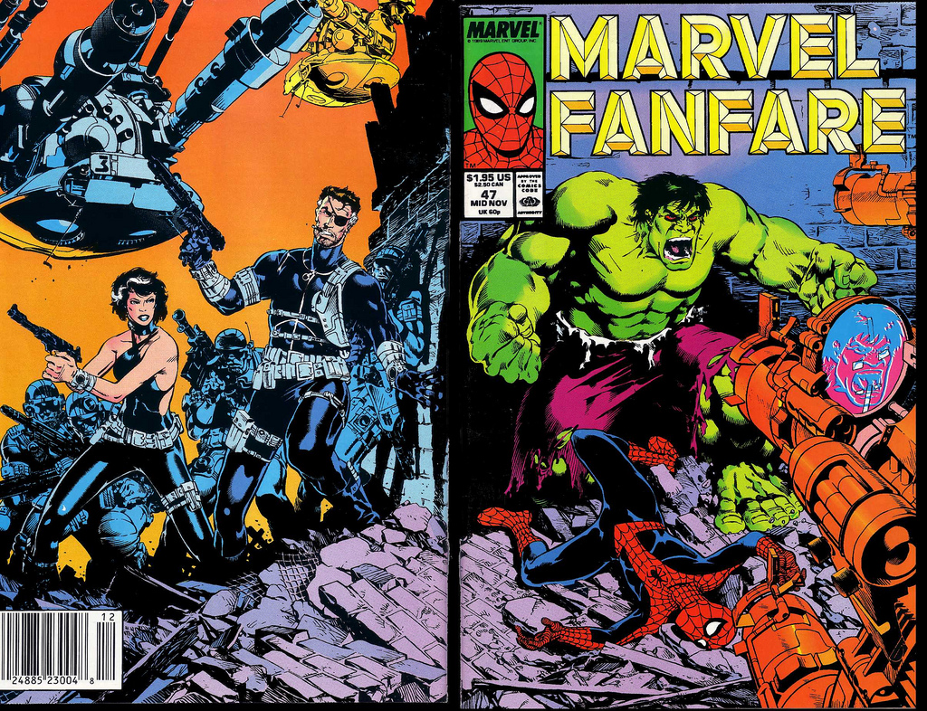
As for the covers, man, they're all so good. He was truly a master cover artist. The covers to Micronauts #2, Star Wars #38 and Marvel Fanfare #1 are personal favorites just because I had those issues and loved the stories and art (all by Golden, incidentally) inside them as well. One you didn't include, but should have (for shame!) is the Batman Special from 1984 - another dramatic Golden cover to an issue full of lovely Golden art.
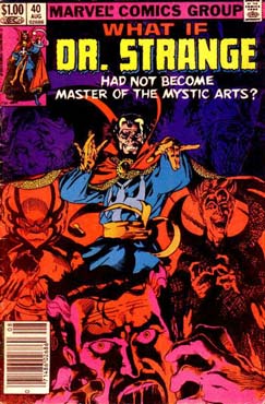
Looking over them now, and trying my best to keep the nostalgia glasses off, I'd say the ones I find the most eye-catching are the covers to Crystar #3, Micronauts New Voyages #5, Rom #9 and She-Hulk #8. Immediate runners-up are the covers to What If? #29 and Hulk #248.
Ah, Michael Golden, how do I love thee? Let me count the ways ...
I think that his covers were some of the very best of the 80's. And I always felt a little disappointed if he didn't do the interior art as well. Totally agree with Edo and Martinex on the quality of those Micronaut covers and Mantlo's writing. (Chris Bachalo's art today reminds me a little of him sometimes when it isn't too crowded). I would, have, and would again spend my quarters on those Dr. Strange, Hulk, She-Hulk and Rom covers.
But I'd spend the whole dollar on the cover of Micronauts #10!
Wonderful topic, thanks!
I like Indiana Jones, Challengers of the Unknown, Doctor Strange, and Star Wars. My favorite comic of his to read was The 'Nam. It's interesting looking through these-- I like his style on certain characters, but not so much on others.
Michael Golden is one of those artist for which I will buy a comic just because he drew it. (Even if it's not something I usually read). Love his cartoon/realism style. You can see his influence in such artists as Art Adams (most notably), J. Scott Campbell, and Chris Bachalo (just to name a few off the top of my head).
Anyway, here are my choices for Golden covers.
My #1 choice is not pictured above (for some insane reason) so I added it myself.
1. Detective Comics #629 (probably my favorite Batman cover ever).
2. Marvel Fanfare #1 (the best thing about that book was definitely the art).
3. Micronauts #2 (I think this was my first exposure to Michael Golden).
4. Indiana Jones #23 (because I really like Indiana Jones).
Tastes vary - and I totally understand that one man's tea is another man's tripe - and I wonder if Golden is like that for the collector. Some folks think his characters are too cartoony, with exaggerated expressions and wide eyes. But that is what I really like about his work. The expressions, though exaggerated, are so much fun.
I thought he drew a wonderful Marionette, Akroyear and Bug for the Micronauts. Akroyear who had no facial features when helmeted could seem so expressive. Bug was wild and full off energy and humor. And Marionette was an unsung heroine of the early 80s and it was her action on the page that I felt defined her.
John Byrne himself complemented Golden and Mantlo's Micronauts paraphrasing that he thought it was a book that he saw as real and good competition and one to be admired and for good reason.
I find that Golden's covers often had crowds or debris or a ton of detail surrounding central characters. He would color the "background" monochromatically so the detail was there but the main characters popped. You can see it in the Defenders, Exiles and Dr Strange covers today.
I said he is my top 5 because I just really like looking at the detail he puts on the page and I can tell it's Golden because he does have a unique style. It is opposite in a way to Kirby; it is softer but still extremely complex and imaginative.
I was never a big Micronauts fan, so I'm not too familiar with Golden's interior work, but he sure did do some great covers. I have some of these (Spider-Ham, Punisher War Journal, that G.I. Joe with the capture of COBRA Commander, etc.), so I'll try to pick ones I don't have.
Outsiders (I liked the original series and I've always been curious about the various revivals); Batman (great cover of Black Mask--at least, I think that's who it is--fleeing from Batman); Generation X (because I always liked the team); and maybe Indiana Jones since I've never read any of those.
Honourable mentions to Marvel Fanfare (a classic cover and a Spidey/X-Men team-up that I've never read), and Excalibur (Nightcrawler and Cerise making out has me curious to read the story ... I don't remember them even being an item!)
Golden was born to do the Micronauts book!
Even after he stopped doing the interiors ,his covers were a good part of the reason I bought the mag until I was done with comics altogether.
1. Micronauts #2
2. ROM #9
3. Alpha Flight
4. Fanfare #47
That Crystar cover looks like Byrne's FF #232
Ahhh, Michael Golden is incredible. His striking artwork has led me to purchase many books I otherwise might not have. His Micronauts, with Bill Mantlo, became quick favorites. Count me among the man's biggest fans. "Cartoony" artwork? If that's cartoony, give me cartoons every time. I love, LOVE, artwork with some expression, some life, some verve, some style. Infinitely preferable to much of today's indistinguishable, overly rendered, slick styles. In my opinion, of course.
As for covers? Like choosing specific M&M's. But make it Detective Comics (Wow, what a cover!). Dr. Strange. The Nam (have never even held one, let alone read an issue...). And, finally, She-Hulk (hey, it's got Man-Thing- he was featured on another of the greatest Golden covers ever, Micronauts 7 with Adams inks).
There's... not a weak cover in the whole batch-! I have a chunk of these issues, and many of them I didn't even realize were by Golden-! I'll echo the general sentiment that, if he was doing the interior art, you were going to get a story that was both beautiful and well-told, visually. After taking a second to adjust to the heightened stylistic level.
Ahhhh-- gimme the No-Prize Book (for sentimental reasons), and call everything else a tie.
Another thought-- does anyone else have a sense of "Golden Age" (can't believe I had to go there) influences in Golden's style? In a very, very good way? Look at that panel w/ Rogue. If you had told me that Bill Everett had done that in the 50's, say, I would have totally believed you. Also-- I'm seeing a surprising stylistic versatility in these covers, yeah? He's definitely not trapped in his own signature look at all.
Good stuff, good stuff---
HB
Wow HB - that's quite an observation about the Everett look. I would agree!
Post a Comment