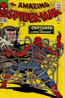
Martinex1: During our walk around the convention floor recently, we discussed the value of Avengers #2 and why that book is not as sought after as other key Marvel comics. Our pal, Charlie Horse 47, theorized that the yellow cover had much to do with it. I've been thinking about that since, and while delving into my back issues and through the internet I came to the conclusion that I actually like yellow backgrounds. The color definitely has a nostalgic feel as it is not used as boldly in more recent comics, but as a primary color it is definitely significant in the gold, silver, and even bronze ages.
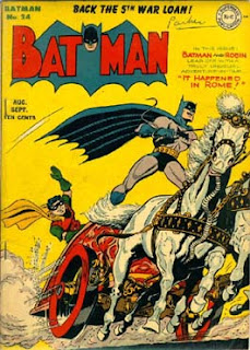
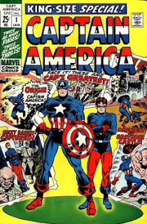
From my recollection, Captain America, tended to use the color frequently on covers. I suspected that it offset the red, white, and blue nicely. While there are many examples with Cap, the trend did start to diminish in the 1990s. I was surprised to see Batman creators using the color so frequently; that too became less frequent as the Dark Knight emerged, but it still tended to show up in the pale moon. I thought Green Lantern would have its share because yellow is the color of his most significant weakness; while used and sometimes quite effectively, it was not as significant as I would have expected. The funny books with their primary color approach used the color readily.
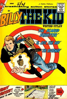
In the below, I chose quite a few covers that I felt used the color yellow effectively. Sometimes it is more subtle, and in a couple of examples it is more centered on the character rather than the background. The color yellow is constantly used in comic logos, but I did not spotlight that here.
For today's round, and since there are so many covers from all ages, pick the four that you feel the yellow was used to the greatest effect. Share your thoughts on the graphic design element and what you think about the color's use in general.
Cheers and don't be afraid (yellow) to share your comments!


8 comments:
After looking at all these covers, I have decided yellow is the worst color ever for backgrounds. Hardly a good one out of the lot.
Yoyo
WoW! Great cover posts! And a great subject!
Well, here's Charlie's thoughts...
If I recall my childhood correctly, I recall assuming that if I was going through a stack of comics or looking at the spinner racks, yellow would track to "Harvey" or "humor" more broadly. I really do enjoy all the Harvey / humor covers. Also, I dig the golden age Superman and Batman ones b/c there is generally a humorous tone to them.
I do like the yellow when it is for stage lighting or (duh) sunshine. So, I like the covers to Batman 442 (Robin in the spotlight) and the Attack at the bottom.
Perhaps one of my all time fav covers uses a yellow spotlight to highlight Chaykin's Scorpion #1 (lady tied to propeller) by Atlas in the early 70s.
The other Silver Age and such are actually fine looking to me; no complaints. But for some reason Avengers #2 just does not excite. I blame the yellow but perhaps the color would be irrelevant... it just is not a dynamic cover for me.
I would be curious to see how much "yellow" is on display at Free Comic Day tomorrow???
Great research as always, Martinex!
That being said, I am going to side with Yoyo, although not as far to the "Never" side as he seemed to land. Echoing Charlie, there seems to be a time and place for it. That being said, the covers that seem to be indoor settings are off to me. Outdoor settings, I can roll with those a bit more.
Many memorable covers in the lot, though. For effect, I'll take ASM 59, Batman 442, Cap 105, and FF 4. On all of the others the yellow doesn't seem to serve any purpose other than "pop" on the shelf or spinner.
Doug
I like the Spider-Man cover with Gwen dancing--she's in the yellow spotlight, he's in the blue darkness backstage.
I like Batman in ancient Rome, with the yellow suggesting the hot sun.
Little Dot, where she's making red dots. Great color all round here, even the logo in blue.
Fantastic Four with Sub-Mariner, by the water/beach, again with sun. I like the dark blue costumes against the yellow.
Seems to me many pulp covers used yellow backgrounds. Perhaps with recent comics, with the darker mood yellow is too cheerful? I like yellow!
"Yellllllo, everybody"!
Marti- another fine selection of covers. Well done. I will say yellow covers were never my favorite, but as always there are exceptions...
Charlie- you nailed it on the humor comics. Yellow seemed to work well on many of those Harvey and Archie covers. That Little Archie cover looks great, I'd pick it up.
Otherwise: Siding with Doug, ASM 59 is a winner. Very appropriate and effective use of color on both sides of the curtain. Also, the Wonder Woman 17 cover is sharp, with that 'monolith ' silhouetted in the center.
And, Spidey Annual 2- just a nice, unusual composition. Perhaps other colored backgrounds would have looked better, but that one just evokes Ditko 1965. Perfectly.
Hmmm, I think I'm gonna have to go full Spidey this time:
Amazing Annual #2; Amazing #12 (I always loved that unmasking scene); Amazing #61 (with Gwen and her father about to get crushed); and I agree with Doug and Garett on Amazing #59 (although that's MJ dancing at the Gloom Room not Gwen--Gwen only wished she could dance like that!)
I always smile when I see the Awesome Android.
On the F.F. cover shown here, he seems to be very blase, bored even, which is a hard expression to pull off when you don't have a face, just a big 'ol block of rubber for a head.
M.P.
Late on this one but Little Dot! Little Dot! Little Dot!
If I see a Little Dot issue in the UK (which is v. rarely) I pick it up. I find the title and covers utterly charming.
And I'll throw in two of the Flash titles as makeweights ;)
Post a Comment