

Redartz: Hello, all! Recently we have taken a look at the artistic creations of several prominent Bronze Age artists, including Sal Buscema, John Romita and Ed Hannigan. Today we will pay homage to another, an artist whose stylistic changes garnered as much attention as his storytelling: Keith Giffen. Giffen is known as much as a writer as an artist, but here we will concentrate on his visuals. His career ranges from the mid 70's up to today, and includes work at Marvel, DC, Dark Horse, First comics, Valiant and Image (and thanks to Wikipedia and the Grand Comics Database for some of the background information).

Keith Giffen started his career at Marvel in 1975. In the mid 70's he did many individual stories, including issues of Marvel Premiere, Amazing Adventures and Super-Villain Team-Up. However, he made his biggest initial impact as penciller on Defenders. Here his art was pretty strongly influenced by the work of Jack Kirby, as seen in this Hulking splash page:
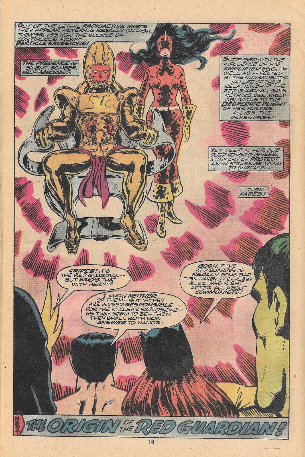
Here we have a couple more Defenders pages, inked by Bob McLeod. Note the "Kirby krackle" on the Red Guardian. And "The Presence" next to her looks like he came right out of an issue of "New Gods". But there was more to Giffen's work than stylish semblances. On the page to the right, we see an early example of Giffen's experimentation with panel layout and composition. And I did, by the way, really like Giffen's Hulk...

Not tied to Marvel, it wasn't long before Giffen started producing work over at DC. Here he tackled All-Star, Claw and Challengers of the Unknown, but he found fame on the Legion of Super-Heroes and Justice League. Starting with issue 285 (Mar. 1982), Giffen began pencilling the Legion, and his distinctive artwork helped raise the title to the upper echelon of DC's publishing. Due to Keith's futuristic imagery (along with great writing courtesy of Paul Levitz), Legion became one of the first DC titles I collected religiously.
 |
| Inks by Bruce Patterson |
 |
| Inks by Larry Mahlstedt |
Here we have f our pages of his work on Legion. Giffen makes frequent use of halftones, shadow and silhouette. He also had great skill at the manipulation of color. Some of his panels had an almost ephemeral appearance that I found greatly appealing, such as the page at left. Additionally, he did fabulous space scenes. Perfect for the Legion.


These two pages were inked by Larry Mahlstedt, who finished many of Giffen's later issues. Giffen's pencils still have a taste of the sheer power of Kirby, but have a tighter, more linear design. And again, we see his play with panel arrangement and color. On the left, we get a glimpse at one of Giffen's 30th. Century cityscapes. Very clean, sharp and aerodynamic; looks futuristic to this viewer.
Oh, by the way, another feature of Giffen's Legion work I enjoyed was the inclusion of the "Interlac" script on signs, screens, walls, and anywhere (including the artists' signatures). Giffen and writer Levitz gave us a translation, here is a chart of the Interlac symbols (again, thanks to Wikipedia):

 |
| Inks by Bob Oksner |
 |
| More inks by Bob Oksner |
Still later, Giffen adopted a looser, more expressionistic style as seen in his work on Ambush Bug and Lobo. His mixing of image, tone, and lettering almost approaches collage...
And he carried his composition and technique over to the post-Crisis Justice League, doing the scripting and providing breakdowns for penciller Kevin Maguire...


More recently, Giffen's art has returned to a more detailed look. But based upon his history, give him a couple more years: He may change yet again. Regardless, I have always found his artwork to be interesting, appealing, and often humorous. And he's willing to take a few chances; I give him cred for that.
Finally, a selection of some Giffen cover art; enjoy, and then let us know what you think!


8 comments:
Love Defenders era Giffen and Legion Giffen. Does anyone else remember his short lived series Punx? His style then was very 5YL Legion taken to the extreme.
He always kind of made me crazy.
LOVED his OMEGA MEN work.
HATED his all-too-entrenched, self-indulgent "minimalist" period-- which seemed to span several one-off appearances in the early/mid-80's. I recall an issue of DAREDEVIL and an issue or two of HEX in particular. A buddy of mine at the time referred to Giffen as "that guy that stick on a title when they want to be sure and kill it."
I didn't love his DEFENDERS run as much as most folks-- mostly because the blocky Kirby-esque style wasn't far enough back in history (at the time) to give it the advantage of nostalgia. And-- he wasn't Kirby. And--- no one was gonna live up to Sal B's work, o'course.
There is no question, though, that he is extraordinarily adept artist who is astonishing in his stylistic fluidity. Heck, even in the examples shown, it's hard to imagine that they're all from the same pencil-wielder-!
HB
Yeah, Giffen's style sure changed over the years. My favourite would be his Legion stuff; the later Justice League work was a bit too minimalist for me. His early Defenders work was good too, kind of a precursor to what he did later with the Legion.
I've loved his work since I first saw it in the '70's revamp of All Star Comics, where he was inking the great Wally Wood.
For me, that epic battle in Defenders #50 was a classic. That android Zodiac...hoo boy.
I loved the new post-crisis Justice League. A return to greatness, even though the inks seemed to subdue Giffen's style.
M.P. (eating a bowl of Kirby Krackle)
I was aware of Giffen but didn't know he moved around so much and was active for such a long duration. I always thought the Defenders issues were inked strangely - a little too lightly. I thought Giffen's style fit the humor of the Justice League at the time but it is definitely much different than his older work. When I saw the Omega Men cover depicted here it caught my attention; I've never read that book so hearing it had good art I may have to pick it up. I do like the effects Giffen worked into the more cosmic stories.
Eric- not familiar with "Punx". I'll have to look that one up!
HB- yes, Giffen's style could be controversial. I would concede that the style he showed on, say, Ambush Bug wouldn't have worked so well on other titles. I looked at him as similar to Bill Sienkewicz, trying some different approaches; some more successful than others.
Mike W- yes, those Legion stories were some of the decade's best. He and Levitz made a fine team.
M.P.- great call on All-Star! Inking Wood. Wow.
D.C. was smart to snag Giffen in the '80's. D.C. had a flowering of great comics in that decade, after being kind of tired and boring for years. They needed a Crises on Infinite Earths. Giffen was a big part of the post-Crises rebirth.
Also, he gave us the Ambush Bug.
Although I do have an issue of Daredevil from the '80's that was pretty good, alligators in the sewer, so he did some work for Marvel too.
I've noticed some commonalities in Giffen's work, like the squinty eyes, odd placement of the hands and fingers, and amusingly, feet, sticking out of the edge of the panel, sometimes in the air and sometimes on the ground. This indicated somebody just got punched. I think Giffen got that from Kirby.
There are some others, like panels with just a guys head and shoulders, looking right at the reader. I've always found these things endearing.
M.P.
Humanbelly - that minimalist period you mention was around the time he was accused of ripping off the Argentine artist Jose Munoz. He didn't stop there, but the Comics Journal in particular went after him for it.
Post a Comment