Friday, August 11, 2017

Riding the Retro Metro: Wednesday August 11, 1976


Redartz:  Hello fellow riders, welcome aboard for another trip back. Back, in this case, to that U.S.Bicentennial year 1976! The Viking lander is on the surface of Mars, the Olympics are in Montreal, and Gerald Ford and Jimmy Carter are in competition for the White House (speaking of the Presidential campaign- I ordered my "Howard the Duck for President" button, even though I'm too young to vote).

Winning the (somewhat less momentous than those above) competition for Number 1 on the US Billboard Pop Chart this week: Elton John and Kiki Dee, "Don't Go Breaking My Heart" 


Rounding out the top five:
2.  Bee Gees, "You Should Be Dancing"
3.  Wings, "Let em In"
4.  Lou Rawls, "You'll Never Find Another Love Like Mine"
5.  Beach Boys, "Rock and Roll Music" 

I can take or leave Elton and Kiki (although many would differ- they top the British chart this week too). I'm more impressed by a cool new song from Cliff Richard, "Devil Woman" debuting  on the top 40. 


 I also like War- "Summer"; a perfect hit for summer (obviously). Oh, and it seems almost like the 60's are back; the Beatles just dropped out of the top 10 with "Got to Get You Into My Life" (reissued by Capitol Records), and the Beach Boys are in the top 5!

Tops in the UK:  Elton John and Kiki Dee, "Don't Go Breaking My Heart".

Turning our attention to tonight's tv offerings, I must admit to having seen few. This summer I'm working for the first time: yes, flipping burgers at McDonald's. So tv viewing is less an option.

US Television Schedule:

Lynda Carter as Wonder Woman


ABC:  Wonder Woman, Baretta. Starsky and Hutch


The Jacksons


CBS:   The Blue Knight, The Jacksons, The Kelly Monteith Show, Kate McShane


 NBC:  Little House on the Prairie, Best of Sanford and Son, Chico and the Man, Hawk


 BBC1:  Nationwide, Man and Boy, It's A Knockout, Are You Being Served?, Explorers, Band Beat, The War Lords

BBC2:  Gardener's World, The Sandpipers, Look Stranger, Festival 40: The Wednesday Play- Cathy Come Home, Beauty is in the Eye

I would watch Wonder Woman, but our tv is usually tuned to "Little House". No Lynda Carter for me,alas. Baretta is good, and has a great theme song. And a bird! Oh, and the variety show continues to attract audiences- Kelly Monteith and the Jacksons are hosting shows on Wednesday nights...


Although my tv viewing is down this summer, my comic reading is up! Just look at some of the great stuff on the stands right now:


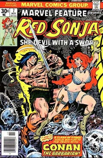
I've a lot to pick up this month. That Amazing Spider-Man with Nightcrawler and Punisher- what a free-for-all, and a Romita cover too! And Conan guest starring in Red Sonja; it just doesn't get better than this. Wait, yes it does! Marvel is showering us with their King Size Annuals this summer, and there's some excellent reading to be had! I'm grabbing all of them I can find, including all three of these pictured here. So who needs tv?
Oh, and check out the cover to the Warren Spirit magazine. That book is fantastic, Eisner's art and stories are incredible. I even like the black/white reproduction (of course they feature one story in color each issue). 


Looking at all those terrific comics has me ready to go grab a stack. And so, we pile back on the bus and return to wherever it is we are, Annuals clutched in our sweaty little hands. Who knows what finds await us on the next Retro Metro? Time will tell...

Thursday, August 10, 2017

Adventures in Comics: Crowning Achievements in Comic Collecting...


Redartz:  Good day, everyone, and thanks for joining us for another Adventure in Comics. Most of us have, or had, goals in the course of our comic collecting careers. Some folks desire to complete a series from beginning to end. Some wish to acquire all the works from a favorite artist or writer. Others have one particular book, a 'holy grail' if you will, the possession of which would serve as the pinnacle of their collection. 

Today, we will talk about those goals, whether or not we achieved them, and how it felt to do so. As is the custom, I will go first, detailing for you my collecting aspirations.

Most of you know by now that my favorite character is Spider-Man. From the beginning of my
My unfulfilled goal.
serious collecting days, at the tender age of 13, I wanted to complete the entire run of Amazing Spider-Man. My collection grew steadily over the years, up to my apex about 1983. At that point I started unloading a few, but kept up Amazing Spider-Man. I bought that title religiously until finally giving it up about issue 275. By that time, I'd come tantalizingly close to succeeding in my quest: I had every issue from number 3 to the most recent, including complete runs of the Annuals, Giant size issues and Spectacular Spider-Man. By the time I quit the title, I'd given up the likelihood of getting my hands on those pricey first two issues. So most of that collection went with the rest, unloaded in the early 90's to help pay bills. It was a bit disappointing not to complete the set, but in the big scheme of things, not that big a deal. It had been a fun ride, after all. 


Of course, some years later the comic bug infected me again, and I started buying new issues and back issues once again. Which brings us to the present: what is my current goal? No longer a completist, I basically buy things that look interesting to me. One goal I do have, though: to re-acquire most of the original comics I had as a young child first discovering the wonders of comics. That period, from 1967 to about 1971, was years before I formally collected comics. Back then I just got cool books off the drug store spinner racks (as long as my parents approved of the contents). This goal is much more realistic, and cheaper, than shooting for ASM #1. Indeed, I've picked up quite a few of those old books already, many pretty cheap. Yes, there were many Marvels, which I have  most of, but also many DC's (especially Superman, whose back issues remain to be fairly inexpensive). Also Gold Key, Archie and digests, which can often be had dirt cheap. The biggest challenge is actually remembering all the specific issues: easy for Marvel and DC, not so simple for the others. But, it's fun. And that's what it's all about, isn't it? Here are a few of those early books I've regained. Each has a special place in my memory...


So that's my story. One goal unfulfilled, but a new goal ongoing and achievable. How about you? Did you succeed in getting your comic heart's desire? If not, how close did you get? Do you have new, different goals as an 'adult'? Give us all the details of your Adventures in Comics...

Wednesday, August 9, 2017

TV Guided: "And Now, a Message from Our Sponsor"...


Redartz:  Greetings, all! As we, here in 'TV Guided', consider and discuss various aspects of television in our Bronze age, how could we not address those little interruptions of our favorite shows? Yes, commercials- be it broadcast or cable (although our BBC viewing friends might have missed some of these), commercials have been part of the tv landscape since the very beginning. And truthfully, the subject of these minute-long memoranda could fill a blog on it's own. So, for today, we'll consider those particular commercials which have managed to stick in your brain. Even after several decades, some ads still pop instantly to mind, the jingles still ringing in your mind (for better or worse). And that is, doubtlessly, exactly the way they were designed. 

Here are a few that my addled brain still can't escape, courtesy of :


Alka Seltzer


Ajax Cleanser


McDonald's


Dr. Pepper


Peter/Paul Candy


I'm certain you all have commercial tunes that still linger in your subconscious. I may have triggered a few here, my apologies if you can't get them out of your head! For revenge, tell us about your advertising 'earworms'...

Tuesday, August 8, 2017

Follow The Leader: Episode 33: Protest Songs!


Martinex1: It is Tuesday, so please Follow the Leader! The fastest to comment here gets to start the conversation topic and we all jump in with observations, musings, and opinions.

Here are the subjects we have discussed thus far:

1) Television Theme Songs and Alien Movies.
2) Best and Worst Movies.
3) Jim Shooter - Editor.
4) Kirby's Art and Michael Jackson's Songs.
5) Building and Changing Comic Universes.
6) Foods We Dislike.
7) Falling Out of Love with a Comic Creator.
8) Comic Collecting - Stops and Starts.
9) Favorite Newspaper Comic Strips.
10) Musicals.
11) Country Music.
12) Favorite Comic Arcs.
13) First Comic Acquisition.
14) The Munsters or The Addams Family.
15) Classical Music.
16) Hammer Films.
17) Misheard Song Lyrics.
18) Reading Comics Today.
19) Arnold Schwarzenegger.
20) Great Comic Issues that Aren't the First Issue.
21) Departure of a Comic Creative Team.
22) Bad Beatles Recordings.
23) Characters that Bore You.
24) Additional Income and Summer Reading.
25) Secret Identities.
26) Five Beatles Questions.
27) Comic Reviews of Recommended Arcs.
28) Comic Book Annuals.
29) Elton John
30) Ray Harryhausen Films
31) Music Listening Devices
32) Last Week:  The Fantastic Four and BitBA Input

So what will the topic be?  Comics, creators, music, movies, television, books, food or something else from the Bronze Age?   Cheers all!

Monday, August 7, 2017

All in the Game: Dungeons and Dragons!


Redartz:  Good day, everyone! Whether it was reading comics, watching movies, or playing games, most of us spent a fair amount of time in what some might call a 'fantasy world'. One game in particular was  /is particularly well-suited to the exercise of imagination: Dungeons and Dragons, or "D&D", as it is commonly called. 
My veteran dice...

For those uninitiated to the realms of this pioneering role- playing game, the premise is simple: a group of players ("player-characters") join together to undertake a quest, guided by the plot and plan of the Dungeon Master (DM). Unlike board games, there is no actual 'board' involved. Instead, there are maps, character sheets (which detail each player's abilities and weaknesses), often representative figures, and lots of dice. The DM prepares a storyline and sets up various monsters, traps, pitfalls, and of course treasure. The players then 'act out' the adventure using their collective imaginations, with the assistance of the various game accessories and books. Beginning D&D can be fairly uncomplicated, but as you gain levels and abilities, the threats grow commensurately greater. Many players have favorite characters they've created and nurtured over many adventures. And the death of a character can be a tough blow.

I know; I played countless games, both as player and DM. I first learned D&D as a high school senior, but really got involved in college. We had a group that would meet every Sunday evening for a session of adventuring. It usually took several hours, a welcome respite from studying. It was almost a party atmosphere: often we'd order a pizza, snacks and drinks. Normally there were about four or five of us; sometimes more, at times less. My roommate and I both served as Dungeon Masters, alternating adventures so we could also play our characters. 

As we were attending art school, creativity was abundant- our adventures were quite varied, and at times bizarre. One quest was based upon "Wizard of Oz", another involved time travel. Our group was mixed- several guys, and a couple of girls. We covered the whole range of characters; mine included a grumpy dwarf, a tall female cleric, a duck warrior, and (my favorite) a half-elf magic user. (Brief comic book-oriented aside: my elven wizard had a familiar, a small creature called a 'pseudo-dragon'; about that time Kitty Pryde in the X-Men found her dragon friend "Lockheed", and I found them both enchanting). 

Over several years, we played innumerable games; some one-night affairs, others lasting for weeks. Eventually our group started graduating, marrying, and joining the working world; we stopped playing. Years later  my oldest son discovered the game, and I passed on to him my old books. I still have the dice- I'd dearly love to play again, once in awhile...

Any other D&D veterans out there? Who were your favorite characters? Did you have some memorable quests, magnificent victories, tragic deaths? Roll your 20-sided die and take your shot.

The animated "Dungeons and Dragons" cast


Sunday, August 6, 2017

Sunday Rerun: We've Got It Covered!


Martinex1: Happy Sunday everybody.   Today we have another "classic" post from our days as guest writers over at the Bronze Age Babies site (thanks Doug and Karen).  Back on March 18, 2015 I opined about comic covers and their aesthetic merits. Take a look below or at the link (date) above.   And at the end I will offer some follow-up commentary. Cheers!   

(BAB 3.18.15) Martinex1: Recently on the BAB site, there was much discussion about John Buscema’s cover artwork for Silver Surfer #2. Doug shared from the IDW book both the original artwork and the modified version that was ultimately used for publication. Most of us had an opinion about which was better but understood completely that the choice was subjective. I believe most also thought both were magnificent and we were probably quibbling over the level of greatness.

It begs the question, “How do we define a great cover?” I suspect the old Popeye adage, “I knows it when I sees it,” holds true. But I often find myself contradicting what I think describes the best comic art. I mentioned before that I tend toward covers that are busy with action and conflict, and that I dislike the cover with a standard character pose and minimalist background. I also hold to the value that Bronze Age covers are better than the modern fare. I am challenging myself if that is always true or if my tastes are slightly more nuanced than that. So I set out searching for covers I like and also covers I don’t like at all.This is not a hit piece, but I thought it was important to define what I dislike about cover art to better identify what I do enjoy. I also am not looking (for the most part) at covers that would be considered in the classic and iconic category. 

Starting with Avengers Annual #10, this was a comic book that I nearly did not purchase because of the cover artwork. The cover looked like an in-house advertisement and had no focus.  We often talk about covers that made us buy an issue; this was a cover that turned me off. The only reasons I did buy it at the time included a) I was a rabid Avengers collector, and b) I glanced at the wonderful Michael Golden interior art.  But this was honestly a situation where I thought about purchasing another issue instead.  In retrospect this was one of the best Avengers Annuals ever with great story and art, but the cover was extremely weak. 

  
I have no idea why the cover was designed as such. I can only speculate that it was hastily crafted after something initially intended did not come together. Since that style of paneled cover was not common, it gave that impression of a rushed job. It did not pass my litmus test. I also don’t believe this is representative of the artist Al Milgrom’s normal output; some of his work on Marvel Presents with the Guardians of the Galaxy was quite dynamic. The added advertisement across the top of the book also irritated me (not just here but throughout that month’s offerings) because it diminished the size and focus of the cover art. For a better paneled cover (the only other example I could remember), see Avengers #197. Although still not to my liking and despite the generally weak layout type, this has more clarity and fits the storyline which amounts to a normal day in the life of the characters.


In my search, I found a cover for the Avengers Annual #10 that was created by the aforementioned Michael Golden after the initial publication. The very little I could find on this piece is that Golden had finished some preliminary rough sketches for the cover of the annual but none were chosen; as a commission he completed this one. Again, this is just some internet hearsay, so I am not entirely certain of the history. But take a look at that black and white artwork. Wow! Now that is amazing and very much to my liking. There is ongoing action and struggle with characters strewn about in the rubble, a new villain in Rogue, the return of Ms. Marvel, and the text that emphasizes not just the physical defeat but the emotional one. The lines, though busy, are clean and clear. The composition is focused. It would have been interesting to see this colored, to see how an artist would have used hues to further emphasize the subjects. The Avengers masthead is of course blocked, so in the real world I am not sure if this would have made print either. I think this gives some extreme examples of how a cover could be conceived.

Aside from my preference for action or ramifications of action to be prevalent in a cover, I also have the counter feeling that I do not like the posed characters standing with broad shoulders staring out of the cover. But then I have to consider Avengers #196. Taskmaster is definitely postured exactly in a fashion I find annoying in today’s comics. But this cover is one of my all-time favorites. 
  
What is the difference?  In my mind there are a handful of factors that come into play. 1) George Perez’ character design is detailed and wonderful, not to mention that Taskmaster is proportionately correct and dramatic. The full figure is loaded with mystery and complexity.  Perez is a master who allows character elements to show through even in individual panels.  It is easy to see the villain’s threatening confidence and ability. 2) The coloring is terrific. It is not often we have that type of green background; I can only think of a couple instances (including X-Men #142) that use that color scheme. The character just pops; the rogue’s blue and white and orange are in nice contrast to the backdrop. 3) The conflict is there; it is in the costume. By that I mean, because the Taskmaster is holding versions of the Avengers’ weaponry from shield to sword to bow, the implication is that this single lone lunatic could take on all of the Avengers. He was the human (or mutant) version of the Super Adaptoid. The text expresses as much in reinforcement. I am not entirely certain, but I believe that up until that point in time this may be the only Avengers cover with a lone villainous figure and none of the heroes present. It was very striking. In later years, we would see Ultron and Kang given this headlining honor, but I truly cannot remember many instances. 4) This type of posing rarely appeared at the time; it was an oddity in that era, not an absolute.


In slight contrast, here in Marvel Team-Up #117 is a cover with Wolverine and Spider-Man reaching out to the reader. This cover at the time struck me as odd and not in the same favorable way that the Taskmaster cover did, and I nearly did not buy this issue. I say “nearly” because I surely do own the issue as Wolverine was emerging as one of my favorite heroes around this time. However, the proportions of the characters seemed entirely wrong and were distracting even in my youth. Wolverine’s leading leg is huge and looks unbalanced; it actually looks like the leg was pasted on to cover something else. The pointy design at his boot’s knee looks much larger than it should be.The forced perspective is too extreme and is almost funhouse mirror like. Even Spider-Man’s extended hand seems overly large. And the layout and background look bland, simplified, and rushed. It was not colored to accentuate any contrast. I see this dark and shady attribute as more emblematic of recent covers as well. Now, by no means is Bob Layton a poor artist. Some of his Iron Man covers are iconic. Again, I am not sure what happened here in the layout and modeling and execution, but it did not work for me.

Often the chosen focus of the cover is a problem. In both Avengers #228 and Fantastic Four #287, this is apparent.   I contend superhero-based comics with a civilian front and center on the cover is not attention grabbing enough. In the Avengers issue I would say that having the “Trial of Yellowjacket” depict Hank Pym on the cover is a mistake.  Even if the interior suggests that it is Hank Pym “the man” on trial, the cover has to be dynamic and interesting and I am not sure this reached that level. The “H.P” on the central figure’s pocket handkerchief and the word balloon just exemplify how unidentifiable the character is to the average comic buyer (it still strikes me that distinguishing between Steve Rogers, Hank Pym, Clint Barton, and even Dr. Donald Blake in their civilian guises often took some second looks). The FF issue is no better. Even with all of the text I did not know what to expect in the issue and without opening it could not even be sure the FF would play anything but a passive role. And this cover is by an all-time great, John Byrne, and despite my love of his work I never purchased this one. All of the rest of his Fantastic Four covers are really top notch.


Now let’s examine some covers I think capture what I truly enjoy. The first is Fantastic Four #187. It’s simple really. It shows the conflict and struggle of the FF, and it holds the key impact that an overwhelmed and relatively powerless Reed Richards is the last standing. It shows a villain in Klaw who is obviously a threat, while holding the coup de grace in keeping the Molecule Man as a mysterious yet imposing figure. It has plenty of detail, and essentially in a single panel tells a story and draws me in. It also has a neat composition with Molecule Man’s legs bordering the action like a curtain opening. And maybe most importantly, I know what to expect when I buy the book.It is in a sense a teaser or trailer for the comic itself.
 
Similarly, Avengers #182 is a nicely rendered battle scene. And although there is no recognizable villain, it shows the magnitude of the brawl. My eye is drawn to Captain America and the pain and determination on his face. The image also accurately depicts what is inside, and what is inside will be exciting. I will point out that this is a piece created by Al Milgrom and Bob Layton. Not bad at all.
 
In conclusion, I have narrowed my definition of what I like on a comic cover and I think it comes down to this: a nice representation of what I am being sold. It can be a single character, it can be a pose, and as long as it represents what is inside I am okay with it. It has to have a sense of conflict.  I prefer action but that action has to be representative of the story. And the characters have to be on model and preferably in costume. The color and contrast is important. Anything mundane and common and small is less appealing.     
 
What say you? What do you see? Do you like something I do not or vice versa? What covers are your favorites, and what made you say, “Meh”. Have at it folks. 

Martinex1:  So there you go folks, a column from over two years ago.   If you click the date link above to the BAB site, you can see all of the original comments.   I will say that at the time I was not in tune with all of the green covers historically available.  Thanks to the folks that pointed that out.  I may have to publish a $1 Challenge someday to display those.   I also want to add a few of my all-time favorite Avengers covers below. Do they fit the criteria I outlined or did my sense of nostalgia bias me?   What were your favorites?  Enjoy, and have a great week?


You Might Also Like --

Here are some related posts: